Heat Maps
Heatmap is one of the easiest way to describe repeatable patterns and find outliers. It is similar to the table, but the cells of the table highlighted with different colors depend on value.
- X axis - fields define table columns (horizontal axis)
- Y axis - fields define table rows (vertical axis)
- Value - fields define cell value
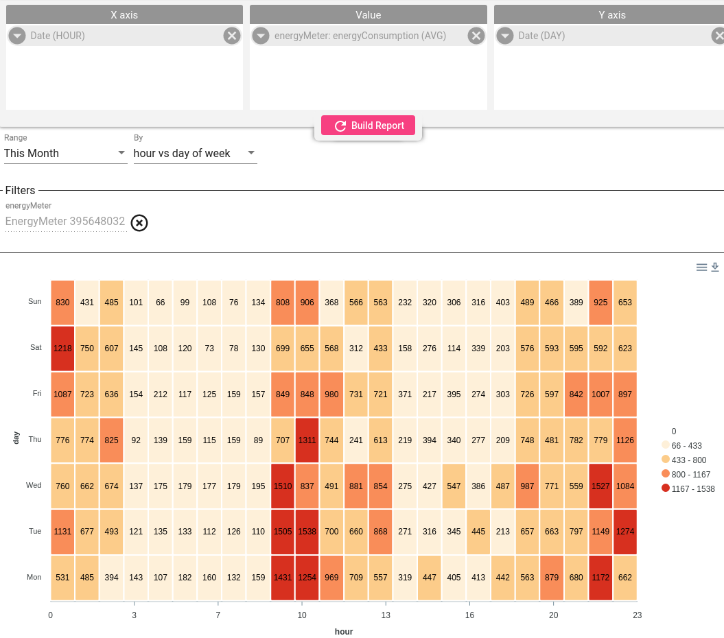
Day, Week, Month Heat Maps
There are few predefined templates available for heat map in By field near time range:
- Hour VS Day of Week
- Minute VS Hour
- Day Vs Month
- Hor VS Day of Month
In this example, we can see the pattern of weekly energy consumption. And now we know, on what day and time most energy is consumed.
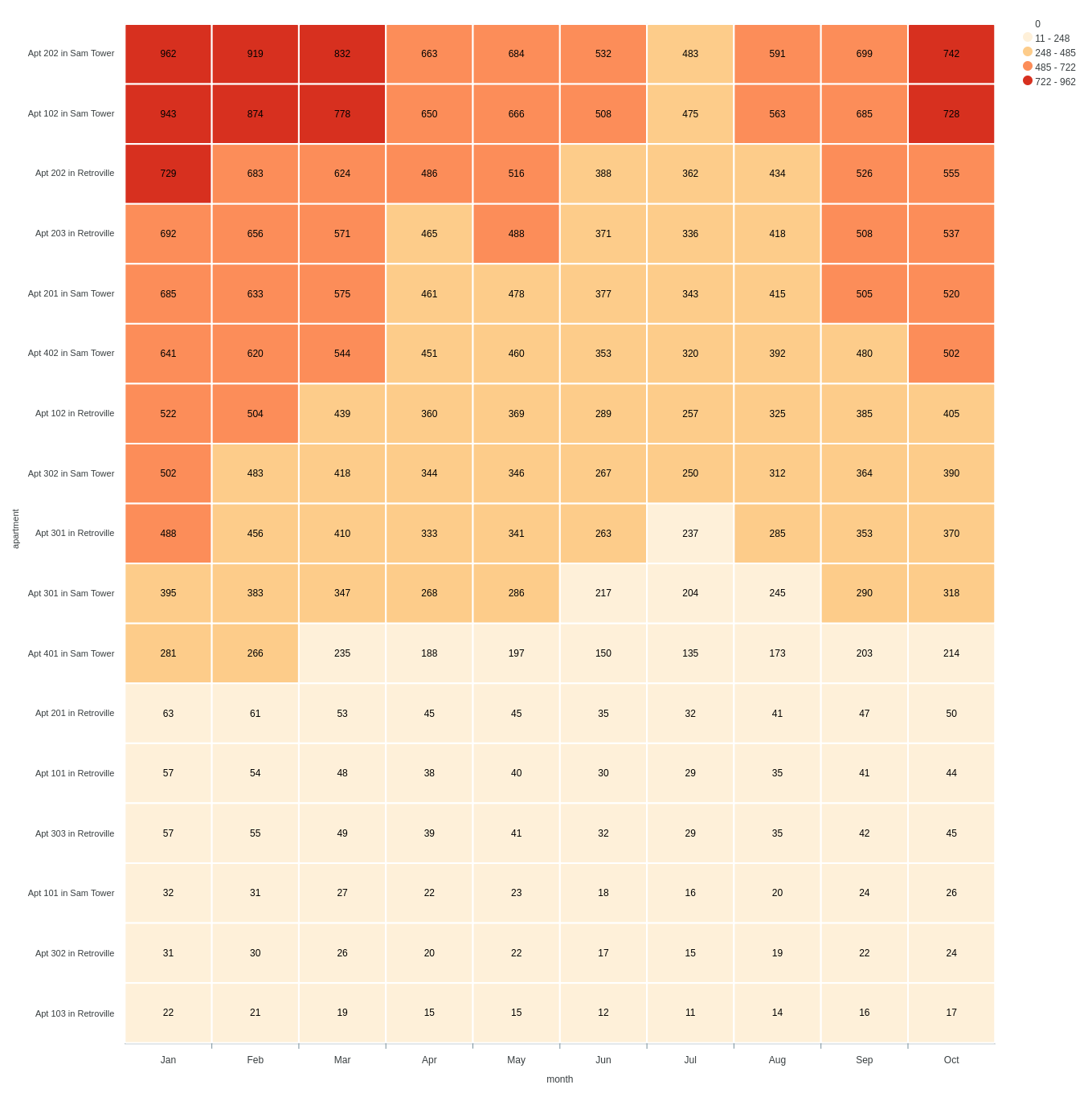
Custom Axis
You can always use your configuration that will match your scenario the best and add required fields as dimansions for the Heat Map.
Here is example that shows
- Each apartment in the building as a separate row.
- Each column represents a month of the year.
- Total Energy consumption as cell value
Now it is easy to identify outliers and their dynamic.