Line Chart
In case of Bar and Line charts you have 3 configurable sections:
- X-axis - define what value will be used in the X-axis of the chart (horizontal axis). In most cases it would be Raw Date field, but it can be any field from your Topology or combination of fields.
- Y-axis - define what value will be used in the Y-axis of the chart (vertical axis). You can drop few telemetry fields in this section with required aggregation.
- Series - split data into multiple groups using single (or multiple) field criteria
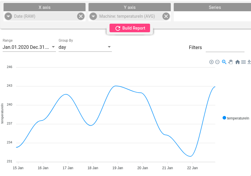
Simple Line Chart
Add Date field on X-axis and numeric telemetry to the Y-axis
Line Chart with series
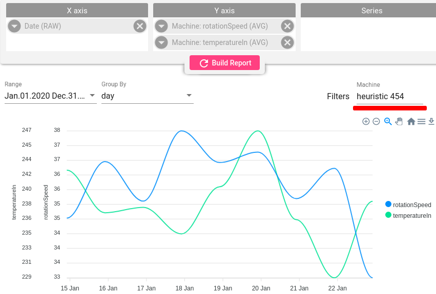
Telemetry as series
When you want to show multiple telemetry fields for selected device/asset you have to add required fields into Y-asix and leave Series section blank. To focus in interested device you can use Filter.
Group as series
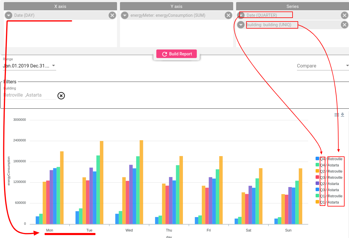
In this case you want to see how same telemetry looks like for different assets/devices or categories. Add required grouping field inti Series section:
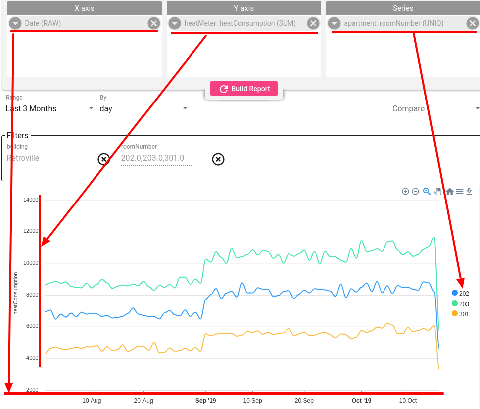
Another example shows how to combine multiple fields in 1 section. This concrete example show what was overall building energy consumption for different quarters split by day of the week.
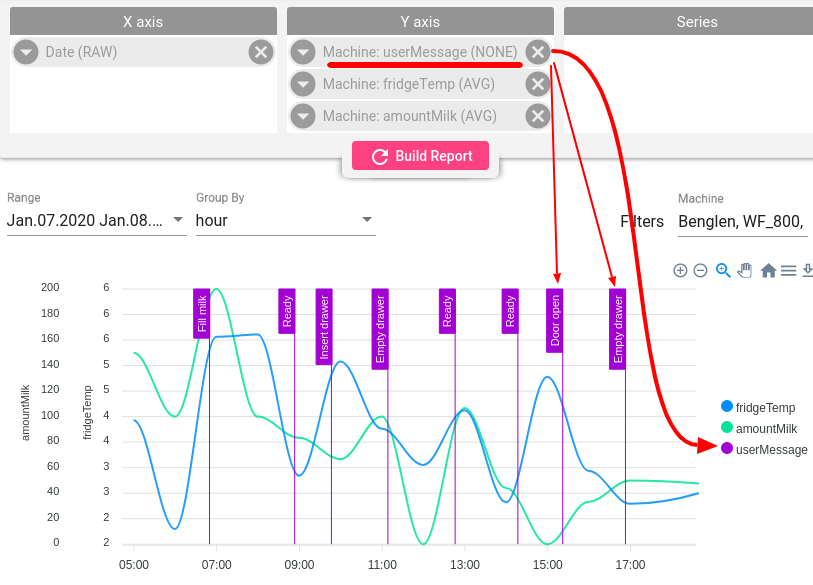
Vertical Lines
Any machine message can be translated into the event and present on the line chart for the investigation. Such events can be represented as vertical lines on the chart and value of the telemetry (numeric or text) would be shown as a label for vertical line.
- Add required telemetry field in Y-axis section
- Choose the aggregation type None on the telemetry card
Color Zones
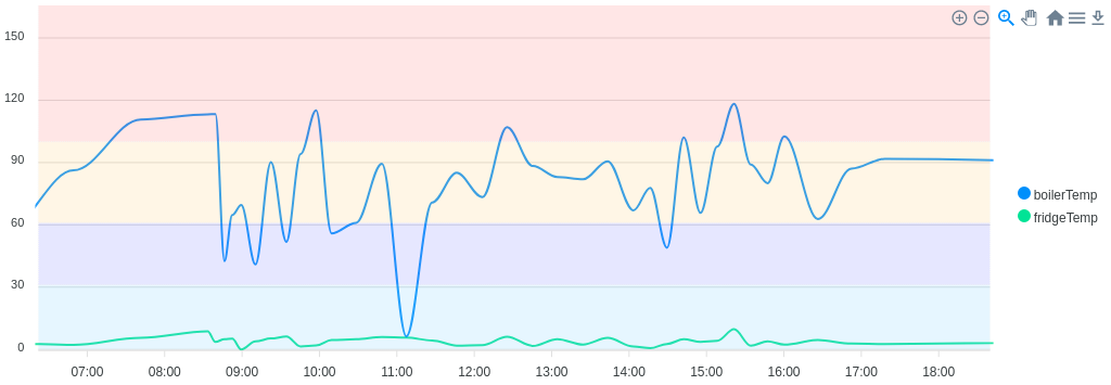
The color zones can be added to the bar and line charts to visually identify certain thresholds.
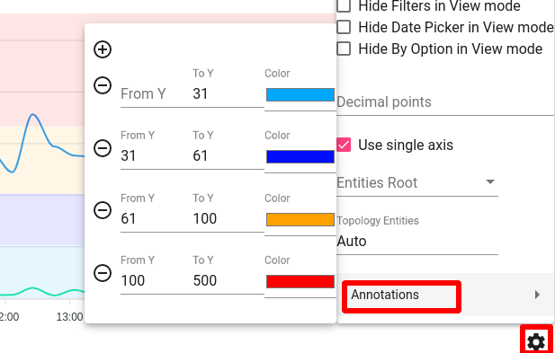
- Navigate to the Setting card and select Annotation.
- Choose the values and color from the color pallet, press ok.
- Click on the Build Report button.
Multiple color zones can be added to one visualization.
Mixed Charts
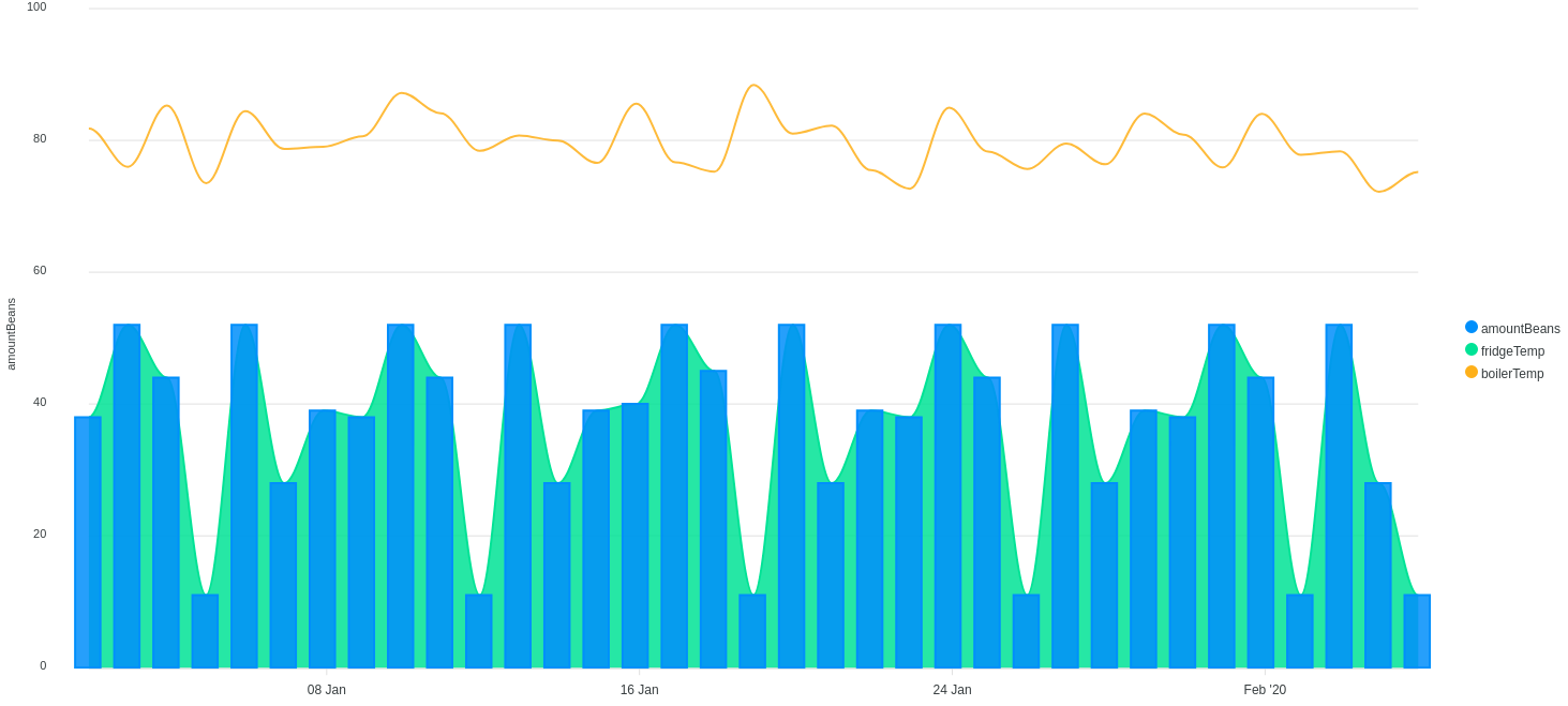
Mixed charts overlay different charts with a shared horizontal axis, but different vertical axis scales (one for each component chart). It is common to use different base chart types, like the bar and line combination, to reduce confusion of the different axis scales for each component chart.
Trendz supports the combination of the columns, lines, and areas in case the ‘Series’ section is empty.
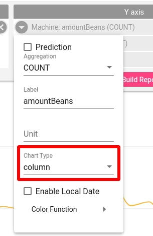
- Navigate to the card with the chosen telemetry
- Choose required chart type - Area, Line, Bar
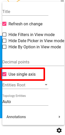
Control Y-axis
By default each timeseries field in Y-axis re-use separate axis. If you show 3 timeseries on chart - you will have 3 different Y-axis.
However if measured unit is the same for all fields - you can join them and show on single axis:
- Open View Settings
- Select Enable single axis